Your Cart is Empty
What characterizes the famous American sportswear brand Nike is its logo. You can easily visualize it, without even being shown it. It's the first thing that comes to your mind when you think of something related to Nike.
Whether it's on a cap, on a T-shirt, or as is most often the case, on a pair of sneakers: you can tell it's a Nike just by seeing that hyper-recognizable logo.
Did you ever wonder how they came up with it? Where did they get this great idea or how long did it take them to find the perfect logo? We'll answer all these questions for you by taking you through the exciting history of the Nike logo.

The very objective of the creators of Nike was that their logo be simple and easily understandable. That said, there is more than one secret behind that upside down, horizontal comma.
The founders did not lack inspiration in creating the famous Nike Swoosh. But to understand the references of the creators, you need to know the full story.
The first question you might ask yourself is: why did you choose a comma to represent this iconic brand? We think you already have your idea, and we assure you that you are not really wrong on this one. The first thing that comes to mind when you see the Nike logo is movement. The spindly and soft comma inspires lightness, flexibility and speed.
The visual is very suggestive, for proof: even its nickname testifies to this. The Swoosh, the little nickname that the English gave to the logo, evokes the sound that a fast object makes when it moves. Very appropriate for a multi-sport brand that promotes dynamism and sportsmanship.
But that's not all ! The origin of the logo goes back much further than a simple check referring to sports.
The second secret behind the Nike logo is that the Swoosh is actually the swept wing of Nike, the Greek goddess of victory.

Many other brands are inspired by Greek mythology to find original logos, slogans and even brand names. The particularity of Nike is that they found a symbol that fits perfectly with the image they want to have.
As the sculpture The Victory of Samothrace (exhibited in the Louvre) gives the impression, the goddess Nike is imposing by her strength and power. Warriors invoked her help and blessing to support them during their most difficult battles. Legend has it that her support helped win many wars.
The goddess descends from an equally virtuous lineage :
The creators of Nike, such a successful brand today, couldn't settle for anything less! It seems that the goddess also watches over the success of the sports brand that has become so popular.
Now that the idea is there, all that's left is to put it on paper! Think again if you think it was easy. The story of the Nike logo is not one of a professional designer who got it right away.

In 1971, when Nike was still Blue Ribbon Sports, a small company distributing sports shoes, the creators were preparing the launch of the brand that was to be imminent. Since they could not afford a professional firm to create a logo, one of the founders Philip Knight had to find other ways.
To make ends meet at the end of the month, he was still working as a compatibility professor at the University of Portland. One of his students, Carolyn Davidson, was learning graphic design, so he jumped at the chance and asked her to help out. So she was hired and worked for them on a freelance basis.
The only instructions she had were to :
It will seem incredible to you, but she was paid a total of $35 for her work on the logo. Does this information shock you? What if we told you that the work took 17 hours, or she was paid 2 euros per hour.
Yes, the Nike logo, one of the biggest American brands of modern times, was designed by a student, in record time, and for a ridiculous price.
To top it off, the designers were not convinced by the final design. After showing them several rejected sketches, Carolyn redoubled her efforts to please the sportswear brand's bosses.
In their haste, since the launch of the brand was scheduled for 1972, they selected the iconic Nike Swoosh. So the logo was chosen by default! Carolyn was told that they didn't necessarily like it, but that they would eventually get used to it.
Carolyn remained in charge of the company's graphic elements for quite some time, even after the Nike logo was reluctantly chosen. She did everything from designing posters to creating brochures and catalogs.
By 1978, she was overwhelmed with work and could no longer handle things alone. Fortunately, Nike had taken off and could afford a real advertising agency.
Carolyn's efforts and contribution to the great popularity of their logo were not forgotten. Upon reflection, they realized that they didn't appreciate the genius of the Swoosh at first.
They wanted to thank her with a very touching gift :
The Nike logo was not always as you know it today. Over time, the logo had to look more modern, be more discreet, appeal more to the public, etc. 
Broadly speaking, 4 aspects have been adjusted over the years:
Over time, the Swoosh has become recognizable: no need for other cumbersome details to advertise Nike. To make it lighter, they decided to do without the brand name, especially on the smallest items.
The ultimate proof that Nike had succeeded in marketing its comma backwards, and that the solo Swoosh succeeded in representing the brand, was at Wimbledon in 92. The first cap with only a Swoosh was given to the winner of the tennis competition, Andre Agassi. The next day, a flood of fans came to spam Nike to get the same one! That's when they really realized how popular they and their logo were.
The Swoosh is no longer just an international sportswear brand. With the advertising campaigns, it is now imbued with the values that Nike conveys.
Perseverance, endurance, bravery, strength, but also personal development and quest for justice: that's what we want to convey through this logo. It brings out all the purity of the brand, it's a ray of hope in a dark world.

Even the athletes who cooperate with Nike are chosen to be ambassadors of these values, and thus defend them at each sporting event.
It is this marketing strategy that has propelled Nike to the top. We do not sell to the public only urban style clothing or sports equipment. Nike is also a lifestyle.
The swoosh isn't just the top in sports, it's also creeping into the art world. Have you ever come across Swooshart on Tumblr? If not, we highly recommend you check it out.
You'll find photos of a graphic designer who rediscovers famous artworks with a special touch: by adding a Nike Swoosh. The choice is far from random, he introduces it where it makes sense in the paintings, sometimes accompanied by a Just Do It to fully highlight the meaning of the image.

The Nike logo takes a new dimension in these contemporary art images, and gains all its meaning. You can also find the #Swooshart on all social networks (Instagram, Twitter, etc.), and enjoy the creations of several amateur artists.
Even if their biggest success remains, without a doubt, the most famous backwards comma in the world, Nike has other successes in advertising. They didn't just rely on the Swoosh to forge their reputation in sports and urban fashion.
What has given their popularity an extra boost and strengthened their mentality is :

Basketball fans love them! You may remember the wonder we had as kids at the mere sight of the Air Jordan. Originally designed in 1984 for Nike's Air Jordan III, that's where it got its fame.
The Jumpman is none other than the silhouette of basketball legend Michael Jordan. The famous NBA player took this pose during a Dunk contest where he tried to score a goal from the free throw line.
Basketball junkies still remember this historic moment that owes much of the player's popularity, and of course the famous ultra-stylish logo.
With shoes engraved with the silhouette of your idol, no way to lose!

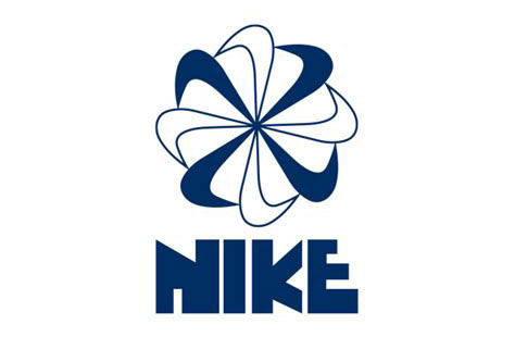
Rarer than the Jumpman, it is mostly found in vintage collections. The Pinwheel Swoosh was dedicated to tennis sportswear. It consists of 8 Nike commas that form a circle, whose point comes in the center. Of different color or intensity, they give the impression of being in rotation.
If you find one in a flea market, do not hesitate to take it: it is a real collector's item.
Voted advertising slogan of the 20th century, it is one of the most famous in the world. If the Swoosh inspires the spirit of combat and determination, the Nike slogan accentuates this effect more than anything else.
However, the origin of the slogan is not cheerful. Nothing related to sports either. Just Do It are actually the last words of a condemned man.
Well, he didn't say it exactly like that. The murderer threw out a "Let's Do It", but the publicist turned it into what is now one of the best slogans in the world.
This brilliant idea boosted Nike's sales that year, and is the focus of most of their advertising campaigns today.
More than 50 years later, the Nike logo is still as original, and still as inspiring. It's a timeless symbol that represents one of the most popular sportswear and streetwear brands ever.
Comments will be approved before showing up.
By Credit & Debit Cards, Paypal or Apple Pay
For all orders over $100
We're available 7 days a week
Reply within 24 hours
Not loving it?
Free return within 30 days


